

- Design for the phone first. Most visitors in Oman arrive on mobile, often from Instagram or Google.
- The first screen must answer three things: what this is, who it is for and what to do next.
- Match the ad. If the ad promised an offer, the page must show that offer immediately.
- Remove friction: fewer form fields, a WhatsApp option and real proof near the button.
When campaigns underperform, the first instinct is to blame the ads: wrong audience, wrong budget, wrong platform. Often the ads are doing their job. They bring the right people to a page that then confuses, slows down or fails to reassure them.
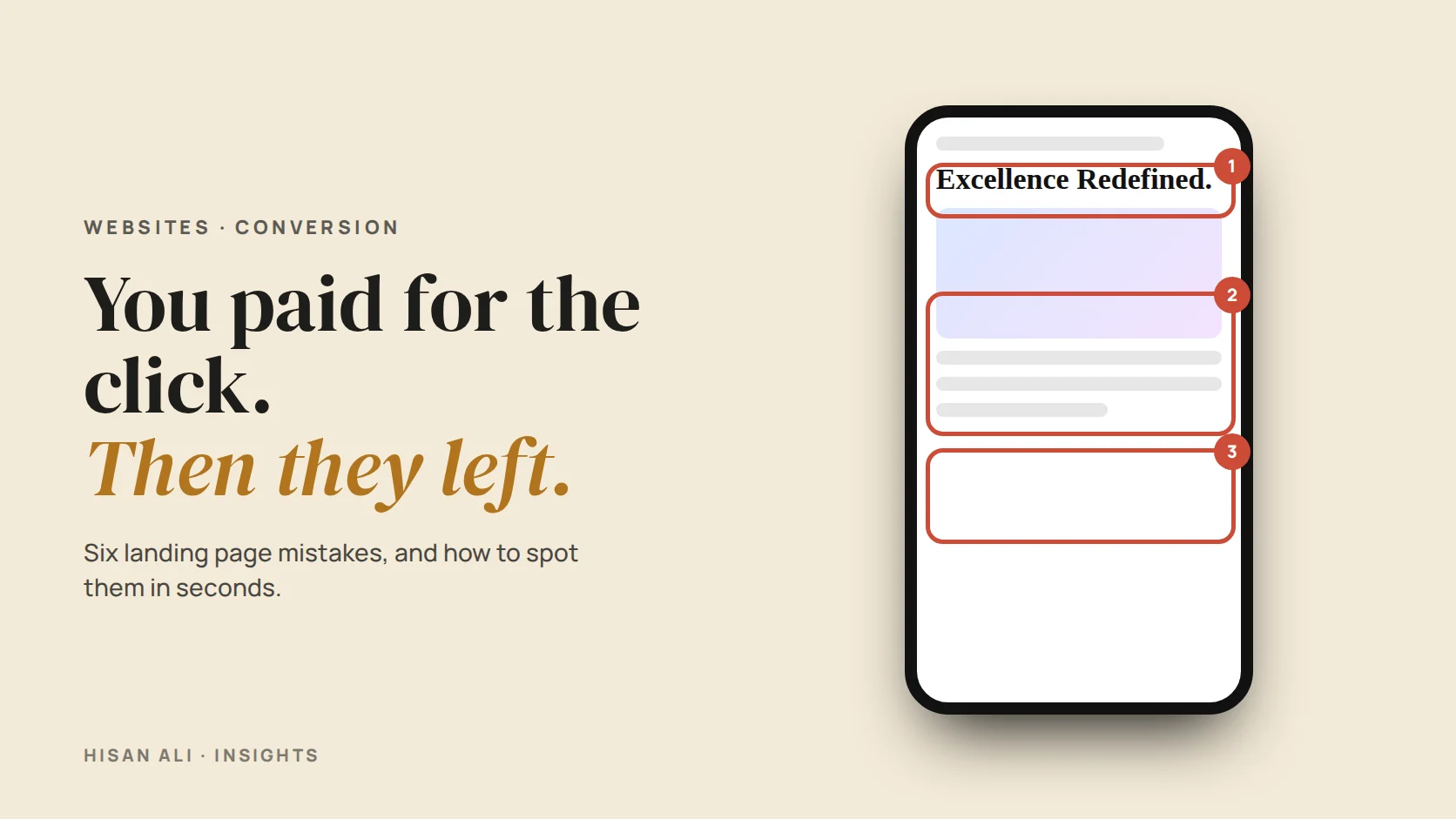
The good news is that landing page problems are usually visible and fixable without a redesign. Below is a page for a fictional Muscat home-cleaning company. It has six common problems. See how many you can find.
01The first screen decides everything
On a phone, the first screen is roughly what fits before the visitor scrolls. In those few seconds they need to understand three things without effort:
What is this?
A headline that says what you offer in plain words. “Deep home cleaning in Muscat” beats “Excellence redefined”.
Is it for me?
Location, customer type or occasion. People need to see themselves in the page.
What do I do?
One clear button, visible without scrolling. In Oman, a WhatsApp button often outperforms a form.
Is this what I clicked?
The offer, image and wording should match the ad. A mismatch feels like a bait-and-switch.
02Trust and proof, close to the button
People in Oman buy heavily on trust and recommendation. A stranger landing from an ad has neither, so the page must borrow it. Put proof near the place where they decide, not at the bottom of the page.
03Removing friction
Every extra step loses some people. Look at the journey from landing to enquiry and remove anything that is not essential.
| Friction | Why it hurts | Fix |
|---|---|---|
| A slow page | Visitors on mobile data leave before it loads | Compress images, remove heavy sliders and unnecessary scripts |
| Long forms | Each field feels like work and a privacy risk | Ask only for name and phone; get the rest in the conversation |
| Pop-ups on arrival | They block the content people came for | Remove them, or delay until the visitor has scrolled |
| Several competing buttons | Choice creates hesitation | One main action, repeated down the page |
| Menu links to the full site | Visitors wander off and never return | Keep the landing page focused on one offer |
04A 10-minute landing page check
Open your page on your own phone, on mobile data, and go through this list honestly:
“A landing page has one job. Every element either helps that job or gets in its way.”
Questions
What is a landing page?
A page built for one specific offer and one action, usually the destination of an ad. Unlike a homepage, it removes distractions so visitors focus on that single next step.
Should I send ads to my homepage or a landing page?
A focused landing page usually performs better, because it can match the ad exactly and remove menus and distractions. A homepage tries to serve everyone at once.
Is a WhatsApp button better than a form in Oman?
For many local businesses, yes. It feels personal and familiar. Keep a short form as an option for people who prefer it, and track both as conversions.
How do I know if my landing page is the problem?
If ads get clicks but few enquiries, and people leave quickly, the page is a likely cause. Conversion tracking and a few session recordings will show you where people drop off.
Method
Written October 6, 2026. Based on reviewing landing pages for paid campaigns in Oman and the GCC. The example page and company are fictional.