

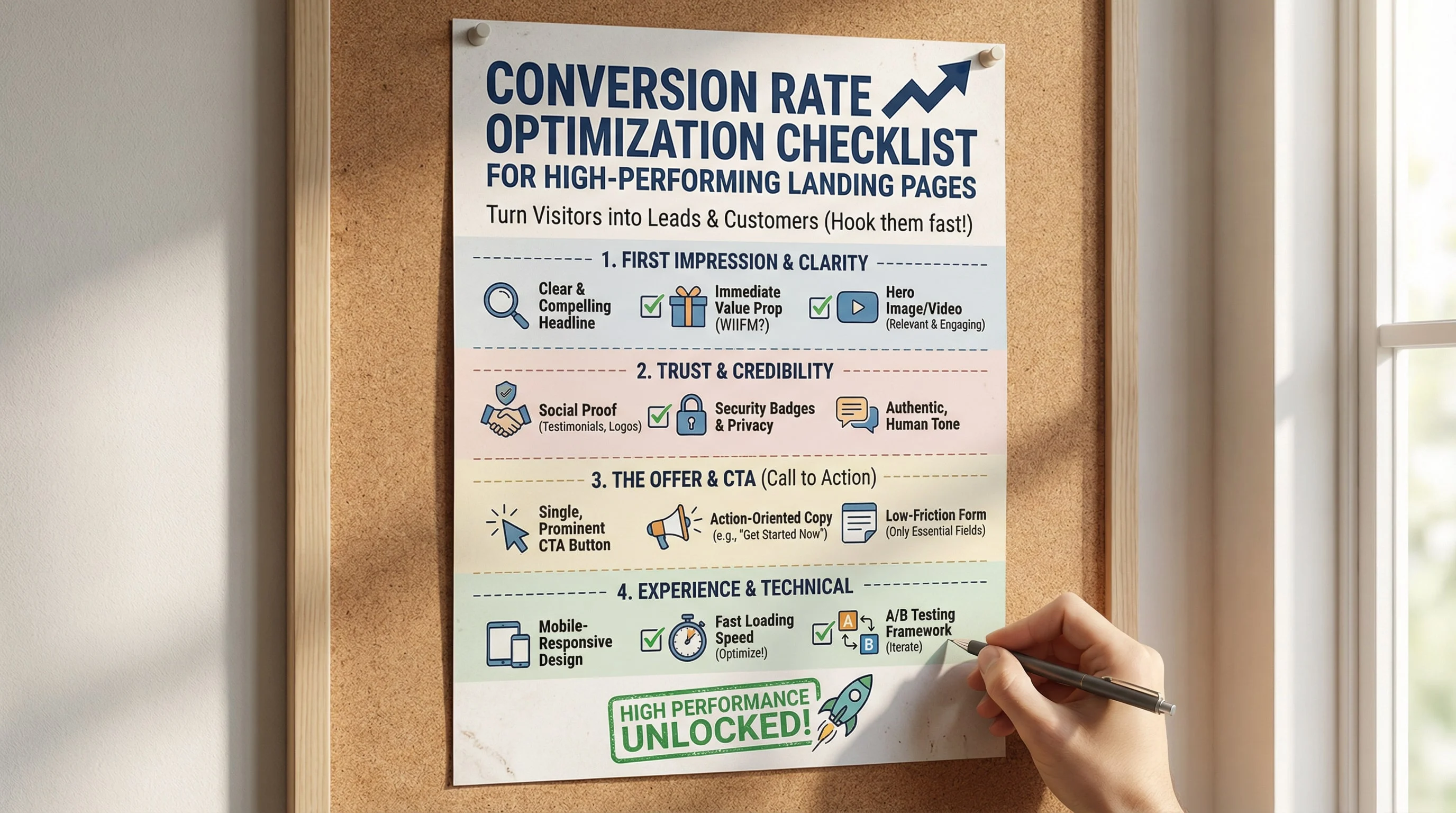
Traffic is only half the equation. If your landing pages are not converting, you are paying for visitors you cannot keep. Use this practical CRO checklist to improve clarity, build trust, and turn more clicks into customers.
Message Match and Clarity
- Headline mirrors the ad or link that brought visitors in
- Value proposition is clear within 5 seconds
- One primary goal per page
Above-the-Fold Essentials
- Single strong headline and short supporting copy
- Primary CTA visible without scrolling
- Hero visual supports the offer, not distracts
Trust and Risk Reduction
- Testimonials or reviews near the CTA
- Logos of clients or partners if applicable
- Clear guarantees, refunds, or trial details
- Security badges for checkout or forms
Form Optimization
Extra fields can add friction, but some improve lead qualification. Ask only for information that supports the next step:
- Ask only for information required to take action
- Use inline validation to prevent errors
- Offer alternatives like chat or call if the form is long
Mobile Experience
- Buttons are large and easy to tap
- Form fields are stacked and readable
- Page loads in under 3 seconds on mobile
CRO reminder: Write the hypothesis and primary outcome before testing. A small change can help or hurt; measure qualified outcomes as well as clicks.
Testing and Analytics
- Set up goal tracking for every CTA
- Run A/B tests on headlines, CTA copy, and layouts
- Review heatmaps to spot friction areas
- Monitor conversion rate by traffic source
Quick Wins You Can Implement Today
- Reduce headline length and sharpen the offer
- Move testimonials above the fold
- Switch CTA from generic to benefit-driven text
- Remove a non-essential form field
Conclusion
Great landing pages remove friction, build confidence, and guide visitors to a single action. Use this checklist to prioritize high-impact improvements and compound results.
Test the full enquiry, not just the button
- Open the page on a phone using a normal mobile connection. Check that the promise, price context and next step are understandable without hovering.
- Submit an empty form. Labels must remain visible, errors must identify the field, and the user must be able to correct it.
- Submit a valid test enquiry. Confirm the confirmation screen, saved record and notification all refer to the same submission.
- Try a slow response and a second click. Prevent duplicate enquiries and do not show success before the server accepts the request.
- Follow a WhatsApp or phone CTA. Check the actual number and prefilled message; measure this separately from a completed enquiry.
A low-traffic decision rule
If a page receives only a handful of leads each month, one extra lead can swing the percentage dramatically. Fix reproducible usability failures immediately. For subjective design changes, record the hypothesis and compare comparable periods with lead quality, traffic mix and campaign changes noted. Do not announce a winning A/B variant after a few conversions.
For an illustrative quote page, the hypothesis might be: explaining what information is needed before the form reduces abandoned attempts without lowering enquiry quality. Choose successful qualified enquiries as the primary outcome, with completion errors and response time as guardrails.
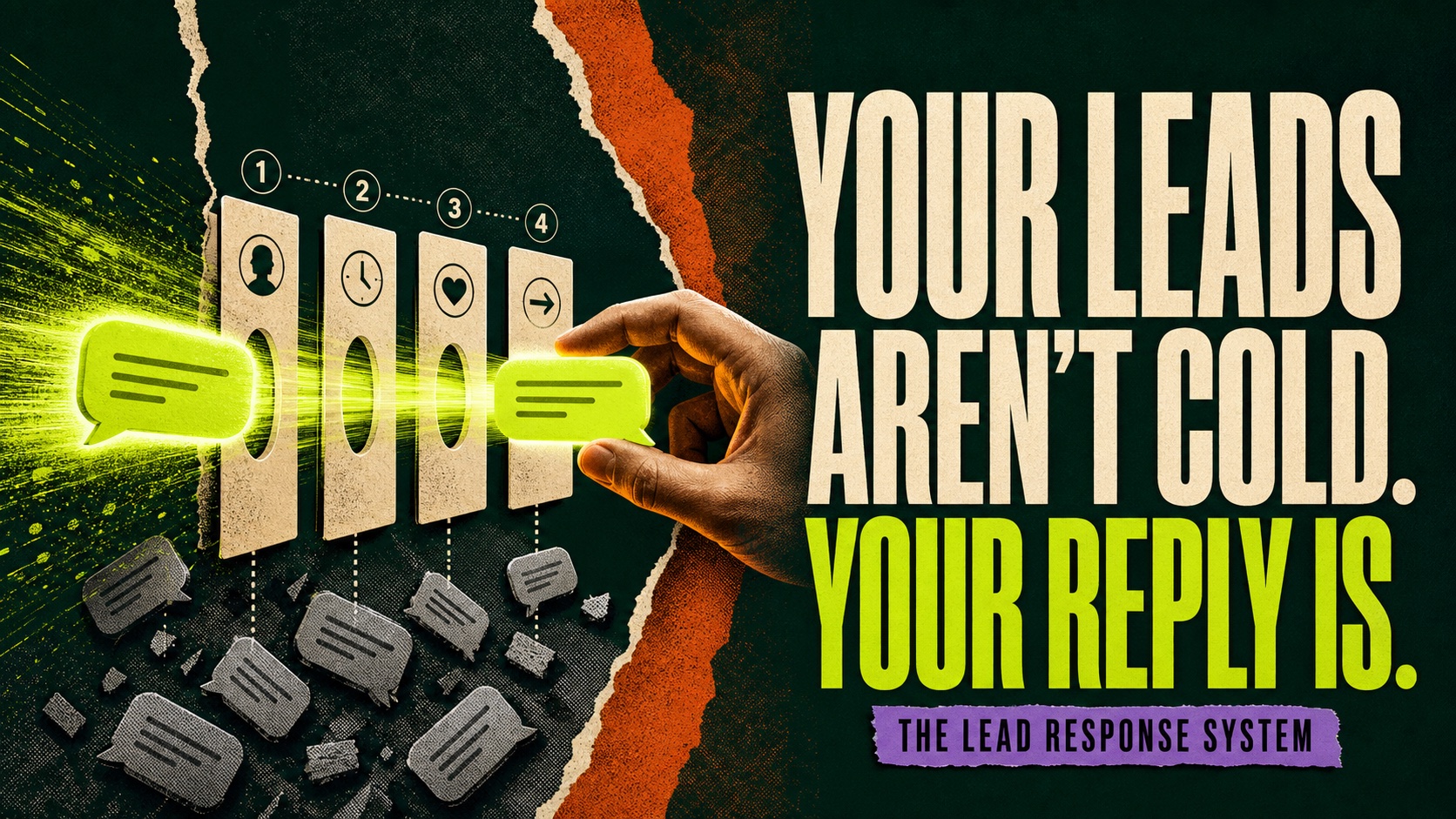
Connect this checklist to lead response after submission and conversion tracking validation.